
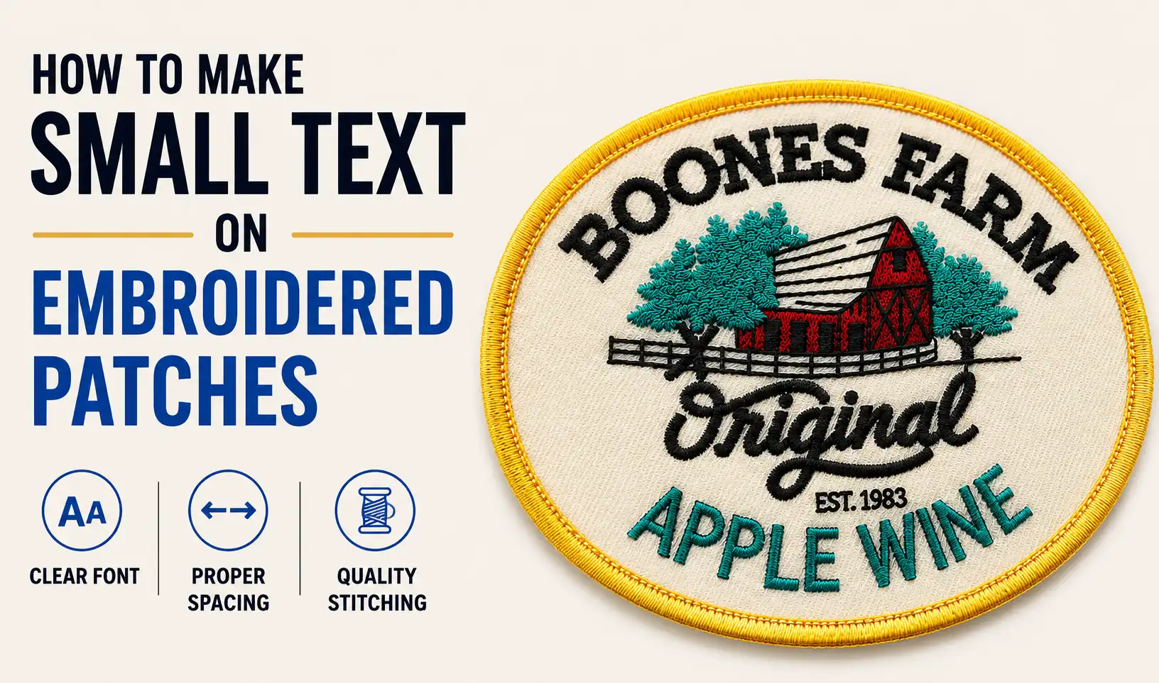
Small text usually fails on an embroidered patch for one reason: the artwork was designed for a screen before it was designed for thread.
On a monitor, a thin stroke can look sharp and a tiny gap can stay visible when you zoom in. On a finished patch, every letter has physical width, stitch density, tension, and spacing. When the design is reduced, counters close, nearby letters touch, and secondary wording can turn into an unreadable line of thread.
The best solution is not to make every detail smaller. It is to redesign the lettering around the final patch size: protect the words that matter, simplify the letterforms, create more open space, and choose a construction that matches the smallest detail the design truly needs.
The patch dimensions determine how much text the design can realistically carry. A 3-inch round patch and a 2-inch cap patch may use the same logo, but the smaller version cannot support the same wording, spacing, and outlines without losing clarity.
View or print the artwork at 100% scale instead of judging it while zoomed in. Place it where the patch will actually be worn and look at it from a normal viewing distance. If a secondary line already feels like fine print at actual size, reducing it further will not create a better embroidered result.
Font point sizes are not a reliable embroidery measurement because different typefaces can have very different capital heights and stroke widths at the same point size. Design around the physical height of the letters in the finished patch.
For simple block lettering, about 5–6 mm is a practical planning range, with 6 mm or more giving the shapes more room to remain open. Treat this as a design guide rather than a fixed guarantee. Narrow serifs, scripts, Old English styles, outlines, tight spacing, and letters placed over dense stitching usually need more space.
Trying to preserve every line from a full logo is one of the fastest ways to make a small patch unreadable. A logo created for a website, sign, or package often includes secondary information that does not need to survive at patch size.
Build a patch-specific version of the artwork and rank the wording by importance:
If every word is treated as equally important, the main wording is forced to become too small. The strongest small patch usually communicates less information, but communicates it faster.
For example, “River District Summer Music and Arts Festival 2026” may be perfectly appropriate on a poster but overloaded on a compact badge. “River District Fest 2026” protects the recognizable name while creating enough space for larger, cleaner lettering. Edit the message first; reduce the type only after the wording is already as efficient as possible.
For small embroidery, the internal spaces of letters matter as much as the outer silhouette. The counters in A, B, e, g, o, p, and R are often the first areas to close when the design becomes too small. Tight combinations such as r+n can also merge visually, and small dots over i or j can crowd the stem.
Small embroidered lettering is easier to read when the typeface has:
Use thin serifs, delicate scripts, distressed fonts, tightly condensed capitals, and decorative Old English forms only when the letters can be made substantially larger. If a distinctive brand font must stay, redraw the small-size version rather than scaling the original mechanically.
When letters begin to merge, the first design adjustment should usually be more breathing room, not another border or outline. Slightly increasing tracking can keep neighboring strokes separate and help small counters remain visually distinct.
Outlines consume the same limited space as the letters themselves. Multiple outlines around tiny type can make the word look heavier while reducing the open area inside each character. For very small wording, one clean letter shape with strong contrast is usually more readable than a complicated outlined treatment.
Arched wording and circular layouts lose usable space because the letters rotate and compress as they follow the patch edge. When small text is packed too close to a merrowed border or embroidered edge, the outer strokes compete with the border and the spacing feels even tighter.
Leave a visible gap between the lettering and the patch edge. If a curved line of text becomes crowded, reduce the number of words, flatten the arc slightly, widen the patch, or move secondary wording to a straighter area of the design. Do not solve the problem by squeezing the letters narrower.
Even a well-drawn font can become hard to read when it sits on a busy or heavily stitched background. Small letters placed directly over dense fill have less visual separation, and the extra stitch layer can make fine details feel heavier.
When possible, give small text its own quieter area: exposed twill, a low-detail field, or a clean shape with less stitching underneath. The design can still look richly embroidered without filling every square millimeter with thread.
Judge contrast as a patch, not as an RGB graphic. Colors that look clearly different on a bright screen can appear much closer when translated into thread. Dark navy text on black, for example, may technically be present but disappear from normal viewing distance.
For small lettering, choose one clearly contrasting thread color and protect the empty space around the word. Do not rely on a pale outline to rescue low contrast if that outline makes the letters thicker and closes their internal spaces.
A small embroidered version of a logo does not have to be a mathematically exact miniature of the master artwork. If scaling creates hairline strokes, tiny gaps, or cramped letterforms, create a small-size version specifically for embroidery.
Useful redraws include widening narrow characters, opening counters, simplifying serifs, separating touching joins, enlarging dots, removing tiny distress marks, and slightly increasing the space between letters. The goal is to preserve the identity of the lettering while removing details that cannot remain clear at the final size.
Do not force embroidery to reproduce detail that the design does not physically have room for. First decide which visual quality matters most: raised thread texture, fine detail, or exact artwork reproduction.
Use embroidered patches when the design can rely on larger, bolder lettering and visible thread texture. This works well for short names, simple wordmarks, badges, uniforms, clubs, and merchandise where the stitched surface is part of the look.
Use woven patches when the patch must stay compact but needs smaller lettering, thinner lines, or a detailed crest. The result is flatter, but the finer woven structure preserves detail that would otherwise need to be enlarged or simplified in embroidery.
Use printed patches when the artwork depends on genuinely tiny text, gradients, photographic detail, or illustration-level precision. Use a hybrid design when the detailed background needs woven or printed construction but the main name should still have embroidered texture.
Before changing construction, remove unnecessary wording first. If simplifying the message creates enough space, the design may still work well as a fully embroidered patch.
Imagine a 2.25-inch round cap patch containing a cup illustration, a café name, “Roasted in Portland,” and “Est. 2018.” The artwork looks balanced on screen, but the two lower lines become too small at finished size. There are four useful design fixes:
Keep the cup and café name, then remove the establishment date and any nonessential descriptor. This protects the main identity without reducing the primary lettering.
If every line truly matters, create physical space for it. Increasing the patch diameter is a more reliable design solution than making every letter narrower or adding complicated stitch adjustments.
Replace condensed or decorative small type with a simpler letterform, open the spacing, remove extra outlines, and reduce the number of line breaks. This keeps the embroidered construction while making the text easier to read.
If the secondary wording cannot be removed or enlarged, use woven or printed construction for the fine detail, or combine it with embroidered headline text. The important point is to change the design system instead of hoping tiny embroidery will become sharper after production.
The best small embroidered patch is not the one that contains the most information. It is the one that makes the important information easy to recognize at the size people will actually see it.
Start with the finished dimensions. Protect the essential words. Use open letterforms, sufficient letter height, more spacing, a simple background, and strong color contrast. If the design still depends on details that are too small for embroidery, change the size or construction instead of continuing to shrink the type.
If your design still feels crowded after these adjustments, ChenyYi can review the artwork at the intended patch size before production. Send the logo, finished dimensions, and the text that must remain readable. Our team can suggest practical changes to spacing, letter size, stitch structure, or patch construction and provide a custom quote based on the final design.

Choose from a wide range of patterns and styles.
Fine stitching, vivid colors, and durable materials.
Simple backing options for quick attachment.
Safe payments and reliable tracked shipping.

Welcome Back
Sign in to access your account
Welcome aboard
Create your account to access everything you need.